Week 13: The Tools That Shape Us
This week felt like the industry collectively decided to care about craft again. Three separate launches all pointed at the same thing: the gap between "looks good in Figma" and "feels good in production" is where the real work happens.
Resources
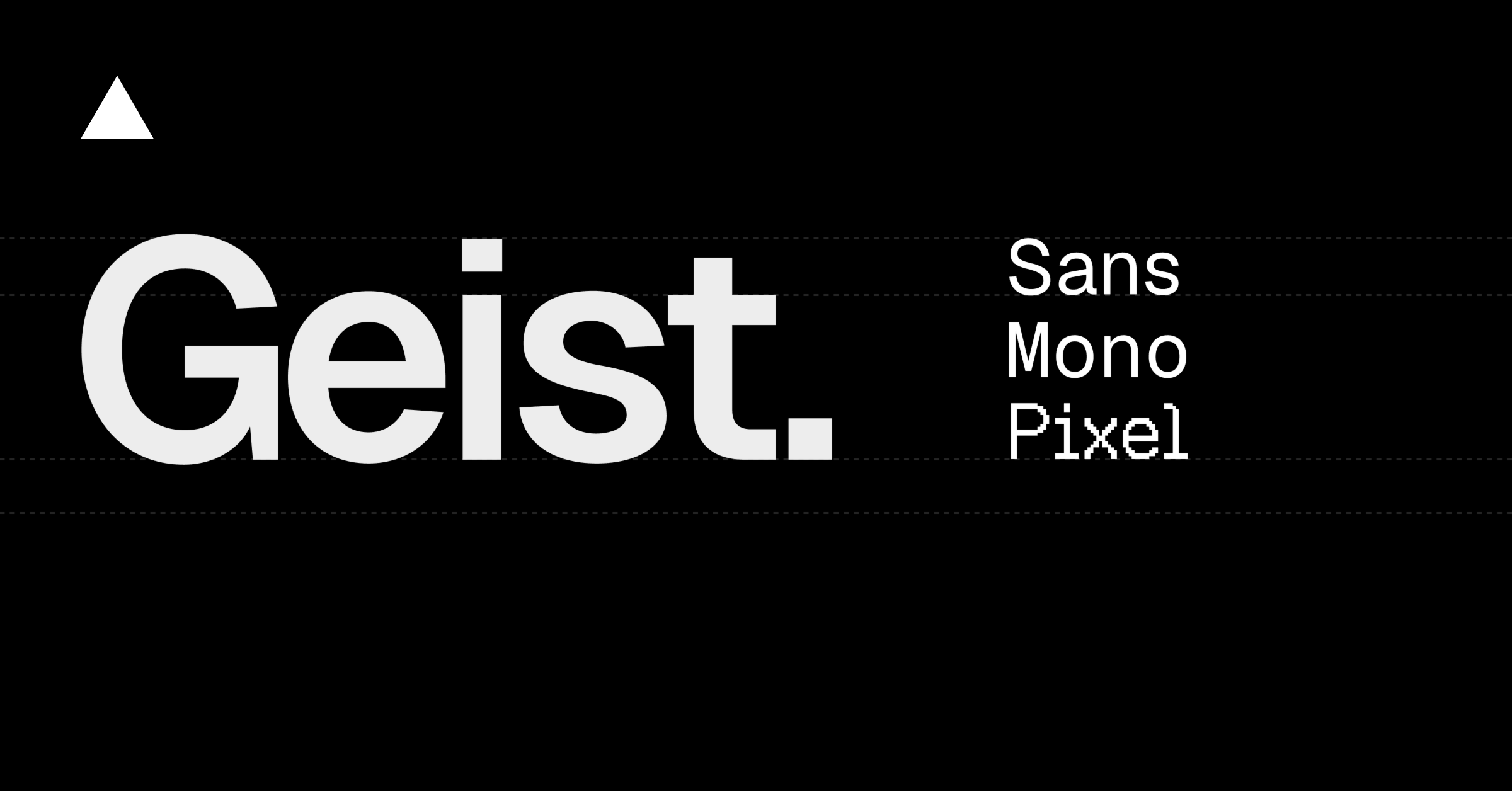
Geist Pixel by Vercel
Vercel dropped five pixel font variants — Square, Grid, Circle, Triangle, Line — built on the same grid as Geist Sans and Mono. Not a gimmick. These work in real UI: dashboards, banners, experimental layouts. The Square variant is particularly good for terminal-aesthetic interfaces.
Sacred Computer (SRCL)
An open-source React component library with MS-DOS energy. Every component — from data tables to dialog boxes — uses monospace fonts, box-drawing characters, and rectangular panels. No rounded corners, no gradients, no shadows. Just structure.
Pretext by Cheng Lou
Text measurement without DOM reflows. Feed it a string, a font spec, and a max width — it returns exact line breaks, heights, and cursor positions. The layoutNextLine API lets you flow text around floated elements with per-line width control. This is what magazine-quality web typography has been waiting for.
Cases
Quaily — Newsletter Platform Done Right
Clean reading experience, good typography hierarchy, card-based archive. What stands out: they treat each issue as a designed artifact, not just dumped markdown. The thumbnail system gives each issue visual identity.
Linear's Changelog
Still the gold standard for product changelogs. Every entry has a screenshot, a one-liner, and just enough detail. No fluff, no marketing speak. Engineering communication at its best.
Observation
The best design engineering isn't about picking the right library. It's about understanding why each tool exists, what problem it was built to solve, and whether that problem is actually yours. Half the tools I evaluated this week are excellent — and irrelevant to what I'm building. That clarity is the skill.